Dashboard
The Dashboard is a heads-up display that lets you instantly take stock of your workflows. It’s a convenient tool for assessing a workflow’s overall efficiency, as well as drilling down into its processes and history.
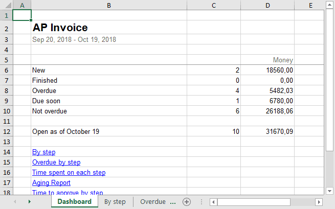
Here’s what an AP invoice dashboard may look like:
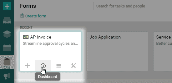
To open a dashboard, find the form you need and click on the Dashboard icon.
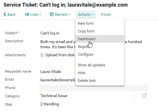
You can also open the dashboard from a task. To see service ticket statistics, for example, click on Actions in the service ticket form, then select Dashboard.
The dashboard shows monthly reports by default, but you can designate a specific time period.
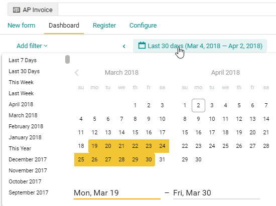
Please note: the reports are generated for the period no more than 30 months.
Summary report
The dashboard’s top report either shows the number of tasks that are open, overdue, due soon or finished, or shows how much money is involved in those tasks. If a value is marked with the word Now, that means it’s the current value, not the overall value accrued over the designated period.
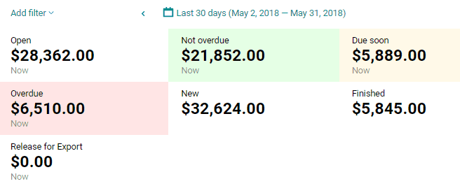
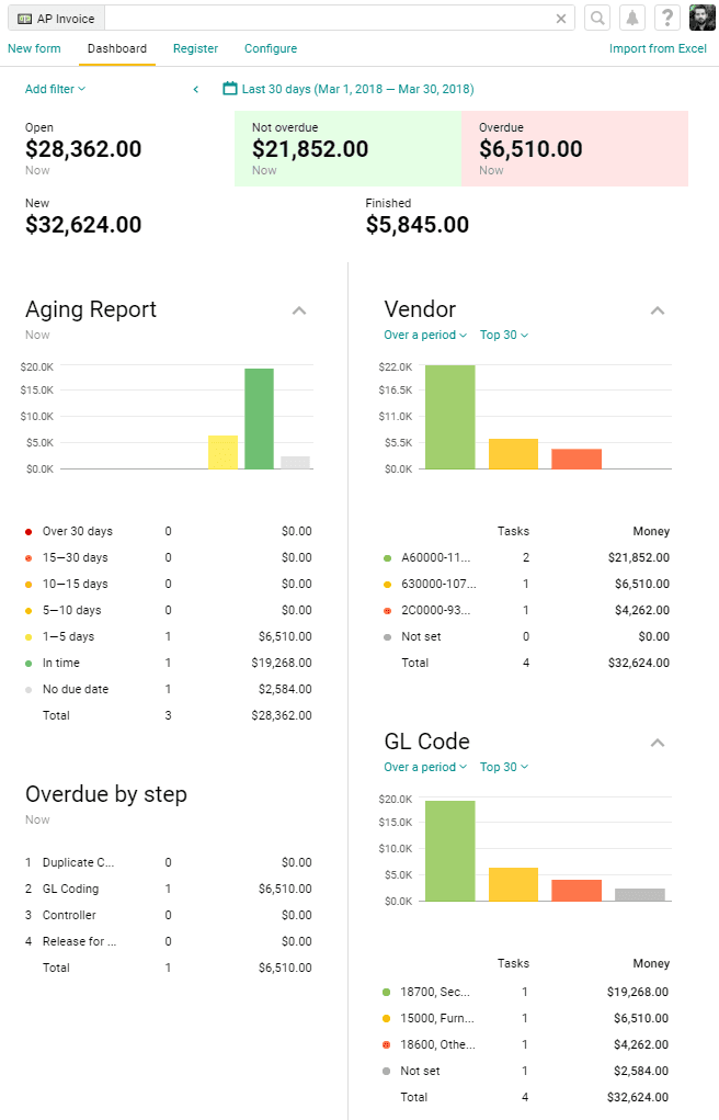
Open shows all the tasks people are currently working on. In the example above, the total value of the AP invoices pending approval is $28,362. If you hover over the value, you’ll see the number of tasks involved.

Pyrus Tip: You can change the default currency symbol in the Money field settings.
Overdue shows the tasks that aren’t marked as finished and are past due.
Not overdue shows unfinished tasks that haven’t reached their due date yet.
Due soon shows tasks with 20% of their time remaining before the due date.
New shows the number or overall value of tasks created in the specified period.
Finished shows the tasks that were marked as finished within the specified period. In this case, two invoices worth $5,845 were approved between March 4 and April 2. You can also see figures from the preceding period here.

Release for export appears only on the AP Invoice dashboard and shows invoices that have been approved and are waiting to be exported to your company's accounting software.
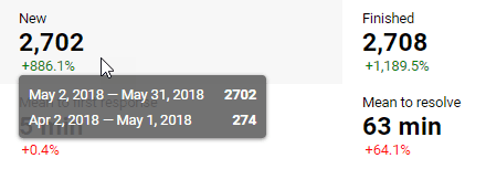
Comparison with prior period
The percentage under this number tells you if the figure has increased or decreased from the previous period. Hover over the widget to see the figures from both periods.
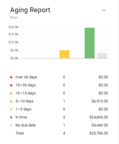
Aging report
This report shows how many tasks were completed on time during the specified period, and the time it took to complete them: 1-5 days, 5-10 days, 10-15 days, 15-30 days or more than 30 days. This report will appear on your dashboard only if the form has a Due Date field.
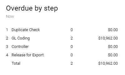
Overdue by step
If a task is overdue, the report shows which step it’s stuck at. In the example below, there are two overdue tasks, and both were held up at GL coding.
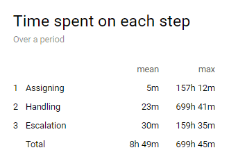
Time spent on each step
This report shows you the maximum and average time taken on each step of a workflow over a given period. This helps identify bottlenecks and see where client requests, invoices, or contract approvals get stuck. If someone sends a task back to a previous step, the report will show the overall time spent on that step, including the time after the task was returned.
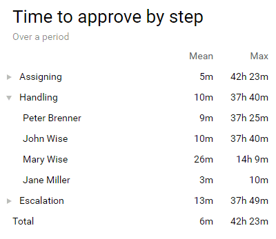
Time to approve by step
This report shows you how quickly a request was sent to the next step. For example, if an employee moved the request to the next step after an hour of receiving it, the approval time will be one hour. You can get access to detailed statistics by role and by specific employee.
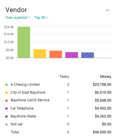
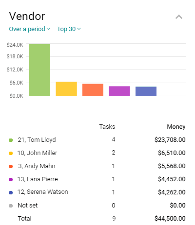
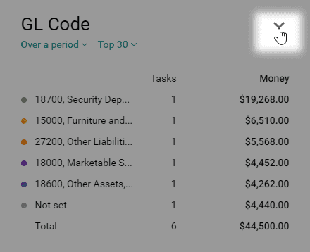
Catalog statistics
If the form contains a catalog (like a list of vendors), the report will show you how many invoices were paid to them and what they totaled.
If your service ticket form has a list of request categories, your report will show the number of requests in each category. Click on the number to see these tasks in the register.
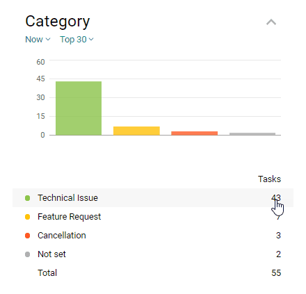
If it’s a really long list and you don’t need the statistics for each item, you can choose to display the top five, ten, or 30 items.

Switch between the Money and Task columns to sort the catalog items accordingly.
You can see current catalog statistics and data collected over a period.

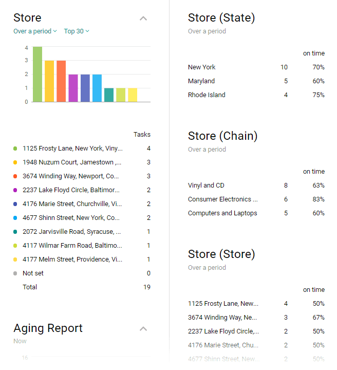
If the form contains a multi-column catalog, the dashboard will show a report for each catalog column. This is handy if you need detailed client statistics or want to see how efficient your support team is. For instance, a company providing technical support for retail chains in different parts of the country can keep client data in a multi-column Pyrus catalog. Whenever a retail store contacts the company’s support service, the operator indicates that store in the service ticket.
The dashboard generates a report based on each column of the catalog that lets you see how many tickets came from each store, each chain, and each city. It also shows the percentage of the tickets that were processed and closed on time. This will work only if the form has a Due date field.
As you can see below, the largest number of service tickets came from New York, but only 70% of those tickets were processed on time. Meanwhile, the chain with the most efficient service is Consumer Electronics.
Form statistics
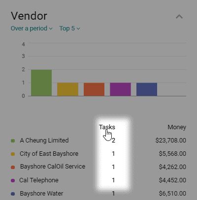
If a form is linked to another form, (a vendor’s card, for example), the dashboard will show you how many contracts were signed with each of them, as well as the total contract sum.
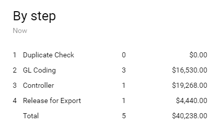
By step
This report shows unfinished tasks and which step they’re currently at. Click on a step to see these tasks in the register.
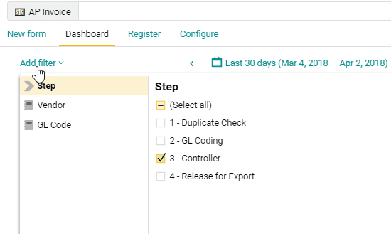
Adding a filter
The dashboard offers filters for more detailed statistics:
- Step. Generates reports that cover only one or several steps. For example, you’re the controller in a AP invoice workflow and you want to see statistics for the tasks that require your attention. Click on Add filter, hit Step, then uncheck the steps you’re not involved in. The dashboard will show you the number of tasks you have lined up, their value if the form contains a Money field, how many of your tasks are overdue, and more.
- Catalog and Multiple choice. This filter type allows you to see how quickly, for instance, your technical support team handles different types of client requests. For this to work, your service ticket form needs to have a catalog of request categories. Open the filter, select a catalog and a category, like “technical issue.” The dashboard will show how quickly your team resolves technical issues, what channels people most often use to submit such requests, and more.
- Contact. This filter can give you a detailed report of an employee’s performance. Suppose your service ticket form has a Contact field where you can designate the person responsible for the ticket. Click on Add filter on the dashboard and select an employee to see the report.
Pyrus Tip: If you need a regular report on something, like a specific vendor, add the relevant filter to your favorites and you’ll always have the numbers you need in reach. The shortcut to the report will appear in the Favorites section of the main menu. You can share the report by copying its URL and sending it to a colleague. 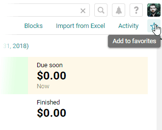
Report view
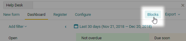
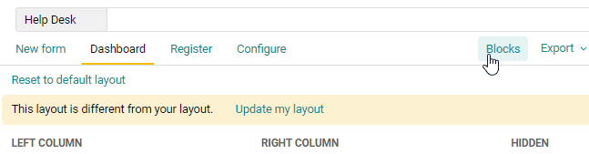
You can easily rearrange and hide your reports. If you check certain reports most often, you can move them to the top of the dashboard so that you see them first.
To do this, click on Blocks.
You can rearrange your reports by dragging and dropping them. The dashboard will display them in the order you specify. In the example below, we moved catalog column statistics and deadline-related reports to the top and we hid the report on request categories.
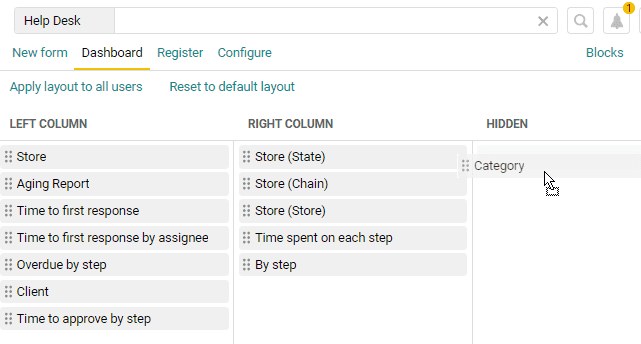
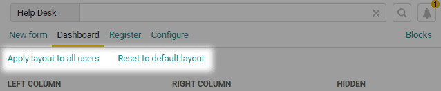
Only you see these changes. To restore the original layout, click Reset to default layout.
A form administrator can customize the dashboard that every user sees by default. To do this, click Apply layout to all users.
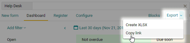
Sometimes it is convenient to customize the dashboard for a specific team. You can edit its layout and share a link with your colleagues. To get that link, click Export >> Copy link.
Your colleagues will see your settings. To save it for further use, click Columns and Update my layout.
You can also hide any diagram or chart by clicking on the arrow beside its name. This will come in handy if you want the report to take up less space.
Export to Excel
Sometimes it’s easier to process and analyze reports as an Excel spreadsheet. The blocks you see on the dashboard can be exported as an Excel file.
First, decide what data needs to be exported: choose a reporting period and hide the blocks you don’t need. Click on Export, and your report will be saved in .XLSX format. 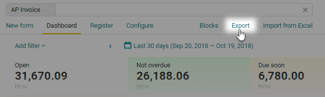
Each report appears on a separate tab. The first tab, called Dashboard, shows overall statistics and links to the other reports.