
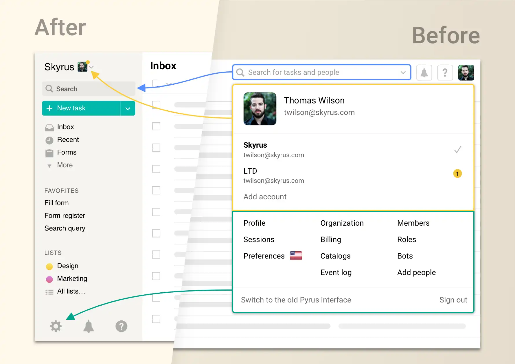
Pyrus is now even more convenient than before: one part of the screen is dedicated to current tasks, so that nothing interferes; the other contains the settings, and everything you need to manage your account, in a compact package. Here’s exactly what’s changed, and what the advantages of these changes are.
In the new interface, your profile, the settings, the search and navigation have been moved from the right side of your screen, to the panel on the left. The search field is at the top, right under your avatar. The catalog and user sections, where you set up the architecture of your organization, the structure of your interactions with clients and vendors, the extensions, your preferences, and so on, are at the bottom. This is also where we’ve moved the notification flag for Pyrus events — updates, and interesting publications on our blog.
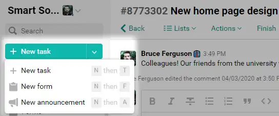
With one click from the menu on the left, you can create not only a regular task, but a form request or a new announcement. You can also open the most frequently used forms.
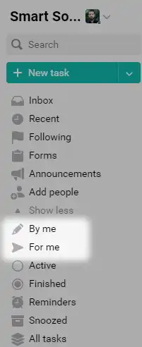
To make it more convenient to switch between tasks, or quickly find the ones you need, we’ve placed the tasks you created, and those where you are the assignee, in a separate section of the menu. They, too, are located in the panel on the left.
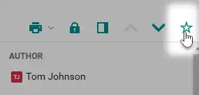
Put them in the main “uncollapsible” menu, and they will always be easy to access. To do this, go into the section you need, and click on the star in the right corner of the screen.
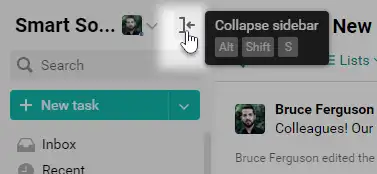
If you need to concentrate on working with the Inbox, you can now collapse the entire panel on the left with one click. This is likewise good for those who use Pyrus on a small monitor screen, as this will allow you to use more of the screen space you have for your main task.
If you have questions about working with the new menu, write to us at support@pyrus.com. We’re happy to help!