Pyrus is an efficient tool for task management and structured team communication. People create tasks, set deadlines, upload files, assign people to projects, and make decisions daily in Pyrus. They ask questions, clarify details, discuss, comment, and substantiate their opinions in a single interface without switching between apps and tabs.
We studied the popular use cases closely and updated the task page interface to maximize its usefulness. Let’s look at the results.
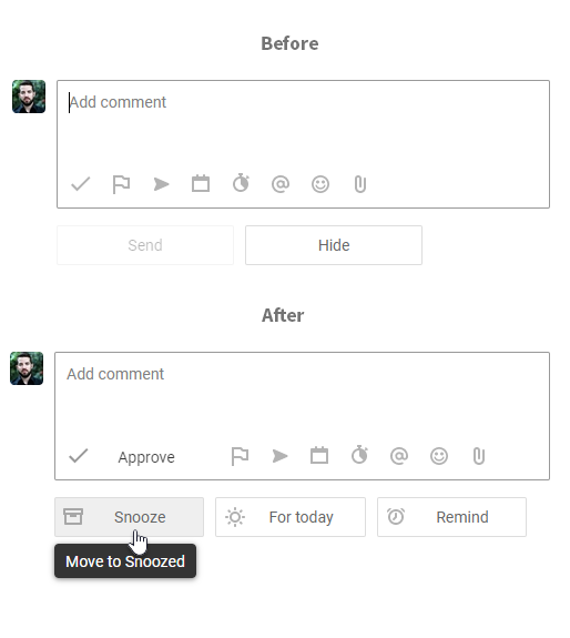
Now the buttons change depending on user behavior. First you see the buttons for quick action on the task. You can snooze a task without typing a word, move it to the «Today» list, or set a reminder to see the task in your Inbox on a specific date.
If you want to discuss details on a task, the button «Send» appears as soon as you start typing a comment. This button automatically hides a task from the Inbox so you can go to the next one. The second button, «Send and stay» just sends your comment and leaves you in the task. It’s like a chat mode that enables dialogue with your colleagues.
Before/after
Now when you open the task, first you see the management options. When you start typing the comment, you see the communication options.

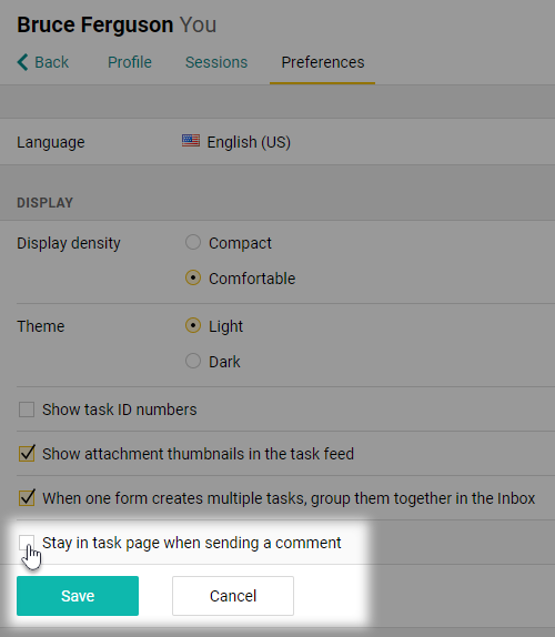
You can change the order of buttons on the Preferences page.

The panel for approving tasks has also been improved. We added a fourth option called Unsubscribe. This is for when you want to leave the task and don’t want any further notifications on it.

This update to the task interface is already available to some customers today. Within a few days, it will be available to the rest of the Pyrus userbase. If you have any questions, you’re welcome to leave them in the comments or email us to support@pyrus.com. We’ll be glad to help!


